Start Up
2021 -2023

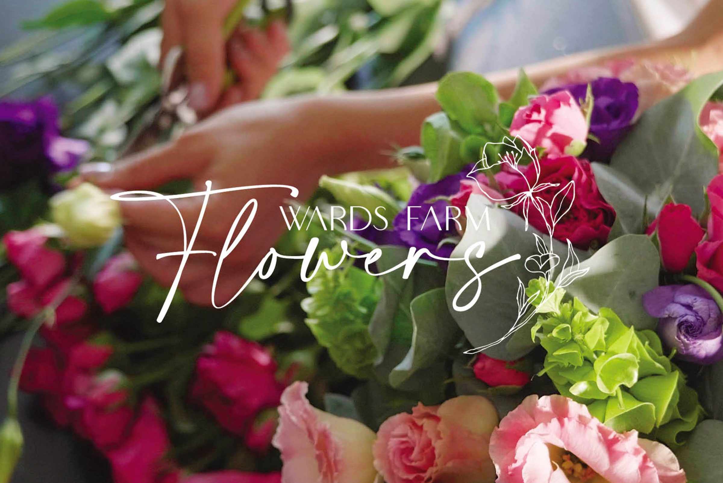
When branding ‘Wards Farm Flowers’, we wanted to capture the essence of natural beauty and rustic charm while maintaining a modern, fresh aesthetic.
Suppliers of quality Organic seasonal British blooms to the Florist trade was conveyed with a free-flowing organic ‘flower’ font and fine flowers in a classic blue. The farm’s history is marked by a commitment to sustainability and eco-friendly practices. By incorporating a stylized floral motif intertwined with modern typography to evoke a sense of new craftsmanship to the farm.
For the website, I focused on a clean, minimal design with soft, sky blue tones to complement the brand’s organic feel, ensuring that the flowers took centre stage. The stationery was kept simple but elegant, with letterhead and business cards featuring subtle floral accents and a soft-touch matte finish for a luxurious feel. For the aprons, I chose a sturdy canvas fabric in navy, with the logo printed in a delicate, understated way, blending function with style. Each element ties back to the farm’s core values—quality, nature, and authenticity—creating a cohesive and memorable brand identity.


The soft morning light bathed the organic flower farm in a golden glow as I worked alongside my husband, who was behind the camera, bringing our creative vision to life. As the creative director, I carefully styled the shots, arranging vibrant blooms and props to tell a story of natural beauty and romance. Rows of sunflowers swayed gently in the breeze, while delicate dahlias and wildflowers added splashes of color to the scene. My husband captured each moment with his artistic eye, our collaboration flowing effortlessly as we combined his technical expertise with my creative flair. Together, we transformed the picturesque farm into a living canvas, each shot brimming with the charm and tranquility of the countryside.


